Choosing the Best Logo Size for Your Website, Social Media and Print

Choosing the Best Logo Size for Your Website, Social Media and Print
Here’s something you might not have considered when having your logo designed: You can’t just plaster the same logo across all interfaces.
The logo should look the same, of course, but it will need to be resized appropriately to look great on your website, social media, merchandise and other print applications.
If you know a little about design, you know that upsizing and downsizing can be tricky, often resulting in low resolution and poor quality.
In some cases, an overstretched or super compressed logo can be completely unrecognisable.
Understanding how your logo applies to different applications can help keep your design looking consistent, increasing your brand recognition across the board and we at Logo Design would like to help you learn about it.
Choose a Logo That’s Legible At Every Size

Your logo will need to look great when used for small applications, like on letterheads and small promotional gadgets.
It should also be easily sized up to incredible proportions for billboards, posters, t-shirts, and other large merch.
The best way to ensure that your logo design will look clean on your website, social media, newsletters and merchandise is to choose a logo that sizes up and down well, without subtracting too much from the image quality.
Logos that resize well generally have a few things in common:
They don’t contain too much detail. Small, intricate details don’t resize well, especially when going small for your social media accounts or letterheads. Typically, a logo with too many fine lines will blur when compacted, creating a mess that barely resembles the original logo, if at all.
They have a semi-uniform shape. This doesn’t mean your logo has to be perfectly square or circular, but it helps if your logo is somewhat symmetrical in shape. If your logo is all over the place, chances are it won’t resize well across formats that require images of different forms. Since some social media pages will need square, rectangular, and circular images for the profile, it’s best to have a logo that will fit all of these parameters.
Logos for online applications are generally under 200KB. The larger your image file, the harder it is to work with for online profiles. Smaller images are easier to resize. Many graphic designers will suggest that your image is under 100KB.
You Might Need Two Designs

One popular method for getting an attractive image at all sizes is to have more than one logo designed.
Of course, it is essential that these two logos look the same for brand recognition purposes.
However, a great designer will be able to create multiple images for you with the same general aesthetic.
In most cases, two designs are enough.
One design should be for large applications and may include more fine detail and thin lines that don’t scale well when the image is downsized.
The second design is for smaller images.
This design will look the same as the first but will have small detail and fine lines removed, which will avoid the smudging effect of downsizing.
Thicker strokes should be used for the small image since they scale down well, without looking grainy or disrupted.
The smaller image probably won’t work well for large applications since it will be plain, without any intricate details.
If you prefer the idea of having one single image that works well for every platform size you can use this same method.
Take the two images, the one that works well at small sizes and the one that looks great on a large scale, and then shift between the two.
Use these two images to balance the amount of detail and the stroke thickness in the final image.
The final result should be an image with enough detail to look great at large sizes, but not so much that you can’t scale it down, too.
The following are examples of basic logo designs that size up and down well.
Logo Size For Print Applications and Merchandise

Because print applications and merchandise vary so widely, the best way to ensure that your logo will work every time is to choose a flexible image that resizes well.
Print applications can require such a wide range of sizes, the most important consideration is the format of your logo.
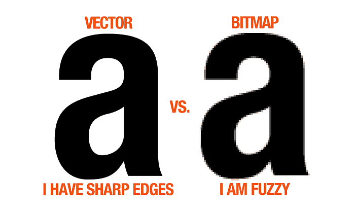
Using a logo in a vector format (like PDF or EPS) makes it much easier to edit, resize, and reformat for your print applications.
It may be handy to have your main logo image saved in vector format, which can help you resize for every application, not just print.
Logo Sizes for Social Media
Unfortunately (or fortunately) all social media is not the same.
Each social page for your brand will require a different size image, and many of them need multiple different sizes for each page.
For a general rule, logos at 1024 x 512 px scale well across all social media pages, but if you’re looking to get more technical than that, here are the sizes for photos on the most popular social media platforms:
Facebook:
Profile Photo: 170 x 170 px
Cover Photo: 820 x 312 px
Photo Post: 1200 x 620 px
Youtube:
Profile Photo: 800 x 800 px
Cover Photo: 2560 x 1440 px
Video Thumbnail: 1280 x 720 px
LinkedIn:
Profile Photo: 400 x 400 px
Cover Photo: 646 x 220 px
Photo Post: 350 x 230 px
Linked Post: 180 x 112 px
Twitter:
Profile Photo: 400 x 400 px
Cover Photo: 1500 x 500 px
Photo Post: 1024 x 512 px
Instagram:
Profile Photo: 110 x 110 px
Post: 1080 x 1080 px
Google+:
Profile Photo: 250 x 250 px
Cover Photo: 2120 x 1192 px
Logo Size for a Website

There is a little more room for freestyle on your personal website, but sizing your logo should still take a little consideration.
Your company logo can look great on your website at any size, small, medium, or large.
Sizing your logo for your website is more about execution than precision.
Many brands get away with extra large logos that spread across their homepage, while others feel that their branding is better dignified with a small corner logo or medium, banner style logo.
When designing your website, choosing your logo size should depend on a few factors:
Does the image size flow well with the rest of the page?
You don’t want a massive image to overload a busy page or a tiny icon that is washed away by large, bold font.
Make sure that your logo size is consistent with your target web design.
A minimalistic website may call for a smaller logo design, while some brands are better told big.
Does the image size fit your logo placement?
The size of your logo will affect the overall feel of your website, but most importantly, it will change the placement.
You will need a different size logo for corner emblems, centred headings, welcome mats, and more.
Corner emblems require a smaller logo, while welcome mats and centred headings usually require something much more substantial.
You should also be aware that your logo may need to be sized differently for different areas on your website.
Your homepage may need a large logo for immediate presentation, while other landing pages may need a smaller version of your logo so as not to detract from the message on each page.
Does the image compete with your marketing message?
Again, there is plenty of wiggle room here, since your logo is explicitly designed to accent your marketing message.
However, you want to use common sense when placing and sizing your logo on your website.
If you’re pressing a hip, trendy message on your visitors, larger logos and welcome mats are encouraged.
For something a bit more white-collared, a small logo may be better suited.
Maintain Proportions When Resizing

Along with choosing the appropriate size for your logo for every application, it is equally important to keep a careful eye on the proportions each time you resize.
Ideally, your logo proportions should stay the same for every application.
Using a scale tool instead of manually resizing can help you keep the image proportionate during alterations.
Failing to keep the proportions consistent can change the look of your logo, stretching in each direction until the entire concept of brand recognition is out the window.
Sometimes applying a border is an excellent way to keep the logo image proportionate for odd applications, like scaling a rectangular image to fit an Instagram post, which is perfectly square.
A Fluid Logo Prepares You For Growth
It may be easy to think that you've done since your logo looks great across the top of your website homepage and squeezes into your Facebook profile picture with ease.
Remember, though, that your business will expand and grow with time, so you should make sure that your logo can keep up.
Brand recognition is an essential marketing strategy, and a fluid logo that resizes for every application is vital.
You may not be printing t-shirts and newsletters now, but that day may be just around the corner.
If you wish to discuss how we can develop your brand or provide graphic design for your product or business, email us: hello@inkbotdesign.com
Inkbot Design is a Creative Branding Agency that is passionate about effective Graphic Design, Brand Identity, Logos and Web Design.
T: @inkbotdesign F: /inkbotdesign
Originally published at inkbotdesign.com on September 14, 2018.
