Member-only story
Sans Serif Vs Serif Font — Which Should You Use & When

Sans Serif vs Serif Font — Which Should You Use & When
Every designer knows that choosing a font makes a huge impact. Fonts have an essential role in our designs, so we should always choose them with care.
You always have to decide which font is the right font for your website or any other piece of written content, digital product or graphic design.
If you are an experienced graphic designer, then you must be familiar with the sensitivity of choosing a perfect font — as we all know that an ideal font increases the readability of a design. So before selecting any font, always have a clear vision of design in your mind.
Before you can pick a particular text style, you have to comprehend the various classifications of textual forms.
While there is a massive amount of different ratings, for example, display, Gothic, script and many others, but the most popular are serif and sans serif.
Today we are going to cover that what is a sans serif vs serif. What defines them and what are the main differences between them.
After we complete these explanations, we will move forward. We’ll give you some information on the proper usage of these two types of font families.
So, you will be able to know which of them is the best fit for specific situations.
The Difference Between Sans Serif vs Serif Font?
First of all, let’s have a look at the appearance of both font families.
What is a Serif Font?

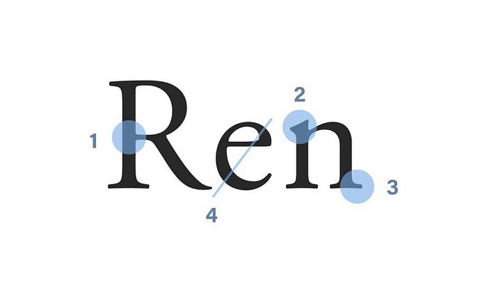
To define what a serif font is, we need to know what a Serif is. A Serif is the little decorative stroke that continues after the end of the stems of letters.
This means that serif fonts will look more professional with a bit more flair than their counterparts. It’s one of the most popular font families of all time.
Serif Font comprises four subgroups incorporating old style, transitional, Didone and slab serif…
